Introduction
As every consumer knows a good packaging design both attracts and delivers. The design draws attention with its visual appeal. While the package’s structural design ensure safe and hygienic delivery of what’s inside. In addition, a package signals many brand values. Drawing customers’ attention to the biodegradable or recycled/recyclable material origin shows alignment with environment-friendly practices. Featuring feel-good stories about the company or its employees humanizes an otherwise impersonal transaction. All this speaks to the idea that packaging is a brand ambassador, playing a crucial part in whether the target customer segment responds to the brand favorably. In this article will explore the Importance of Right Packaging Design for FMCG industry.
The Package Design Journey
Package design is not unlike designing a product itself. Considering the complex requirements of modern packages, multi-functional teams of packaging engineers, graphic artists, marketing professionals, procurement specialists, and manufacturing managers work in collaboration. The basic steps of creating packaging are:
- Research: Brand guidelines, target market, product features etc. are researched
- Concept Design: Based on the research a basic concept is developed and refined
- Prototyping: Starting with sketches, then progressing through wireframe, soft prototype and final prototype, the packaging goes through iterative improvements
- Refinement: Feedback from internal and external test audiences and stakeholders is used to refine the final production specifications
- Production: The packaging is mass produced, quality tested, and launched. Post-launch effectiveness measurement and analysis of the package’s market reception become inputs for the next round of iterative improvements
While the above refers to the holistic development of a new / improved package. Packaging design broadly branches into Structural Design and Graphic Design.
Structural Design
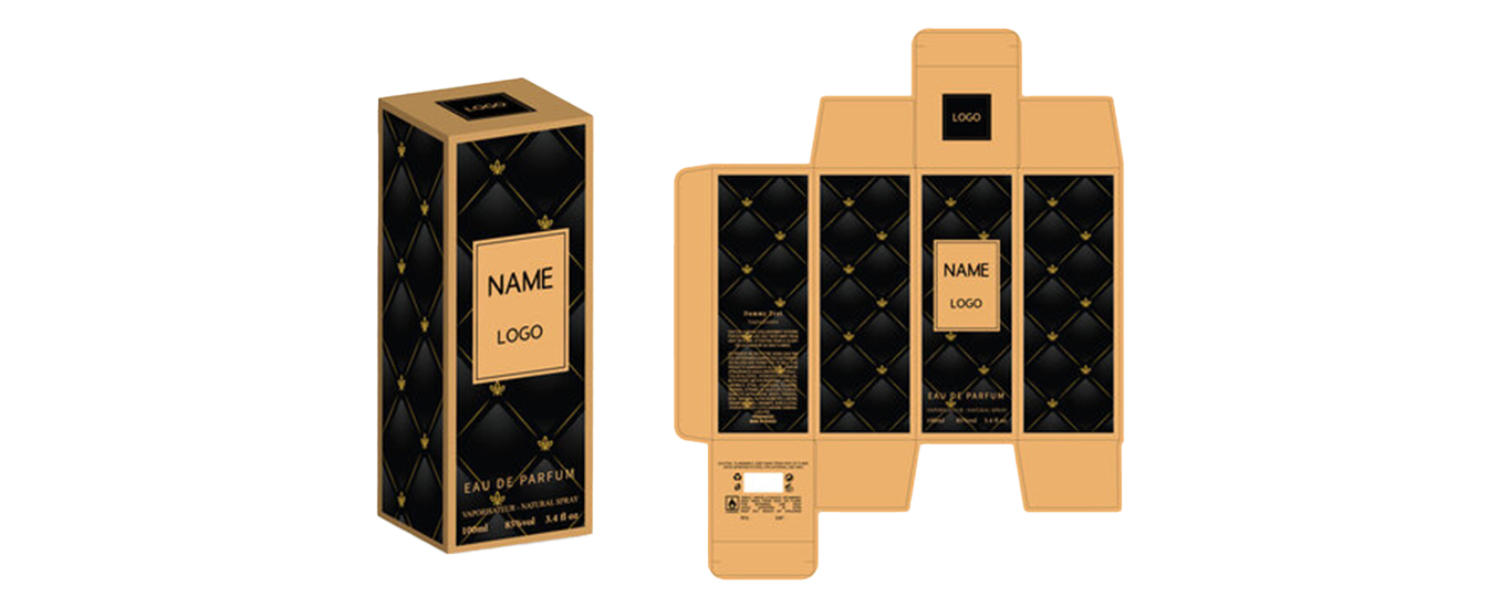
Structural Design focuses on the science of creating an efficient protective structure to ensure the product reaches the consumer without harm. The Structure Designer never works in isolation. In most cases a new package is required for an existing product; therefore product dimensions as well as protection requirement parameters are available to the designer. In some cases, the packaging becomes more recognizable than the product itself. One of the most famous examples of this is the Toblerone chocolate bar. Apparently inspired by the shape of Mt. Matterhorn, a famous mountain as Swiss as the chocolate. The triangular-shaped package enclosing a row of 11 triangular chocolates also happens to have superb structural strength because of its shape. Furthermore, six bars fit perfectly into a hexagonal tube, making it perfect for transporting.
New advances in material technology has helped designers create “active packaging” i.e. packaging with added elements to improve protection or enhance the product’s quality. For example, oxygen or ethylene absorbers and anti-bacterial coatings reduce spoilage. Some newer packaging types even add essential nutrients like proteins, vitamins, electrolytes etc. to the food inside. Edible packaging doesn’t just deliver the product inside it safely. It even becomes flavoring!
Graphic Design
The term “graphic design” here refers to all visual attributes of the package, including the artwork, type of color used, any special effects like texturing, holograms etc., As well as the messaging- both marketing and regulatory used to draw and hold the customer’s attention before and after purchase.
The “front of pack” design is usually more “creative” than the back, though this is of course neither a hard and fast rule, nor really always applicable, especially in newer trends where designers create “infinity walls” on round cans, with no clear “front” and “back”. However, for most polygonal shaped carton-type packages. The front typically features the product and brand name in bold lettering, along with mascots or attractive artwork and possibly newer elements like see-through windows. The back of the package is usually where the regulatory information. Like ingredient lists and contact information is to be found.
Starting from a concept sketch- a lot of graphic designers prefer to do even this step on electronic devices now, like iPads, Wacoms, etc. The designer works from the beginning in a collaborative setup, with inputs from Marketing, Product, Brand Management, Legal, etc.
There are now industry-standard, powerful end-to-end design software available to manage the artwork creation. The graphic designer usually works in Adobe Illustrator or similar Vector software. However, artwork creators generally work in 2D.
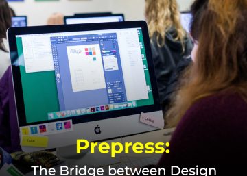
The ball now passes to a “pre-press” artist. The Pre-press artist is responsible for making necessary changes to the artwork so it looks right on the final surface- be it a giant representation of the package on an outdoor vinyl billboard, or different versions of the product packaging in clear plastic, paperboard, etc. Especially in the FMCG industry, where 50+ SKUs of a single product like toothpaste may be sold in a dozen geographies. There are hundreds of variations in size, shape, local language, regulatory guidelines. As well as in the actual artwork for cultural reasons.
Using specialized software like Esko ArtiosCad, Esko Studio, PackEdge etc. As well as the Adobe Creative Suite the pre-press artist adjusts artwork dimensions (including a very interesting technique called “distortion” in which pre-press artists “distort” or “warp” to adjust a flat artwork to match package contours, especially around curves), layouts and other elements. Another important job for a pre-press artist is color correction. Usually a Pre-press expert has in-depth knowledge about the packaging manufacturing process. Therefore he can interpret the graphic designer’s color scheme and adjust it to achieve the same result using standard CMYK combinations. This is a crucial step to keep final package pricing down, because every new special color that a printer needs to use shoots up the package price.
One very important new role for a pre-press artist is 3D mockups. In the past, once the print-ready file was sent to the printer. The latter would actually produce a prototype physical package. Ship it to the customer, make adjustments based on feedback, and then proceed to a print run. These days, Pre-press artists can create life-like 3D mockups in Esko Studio which are guaranteed to look like the actual physical print. Down to the sheen of the material. Obviously a physical mockup is still necessary especially if there are textural elements to check. But 3D mockups play a significant role in reducing time to market and keeping costs down.
Conclusion
Creating the right packaging solution for the FMCG industry is not an exact science. Firms develop expertise in particular areas- graphic design, packaging prepress, and printing based on decades of experience, in-house R&D, and knowledge of client needs. For example, Manipal Digital has over a decade of experience as a Packaging Pre-press expert. It is also a sister company of a major packaging manufacturer, and part of a group that has been a leader in the printing and packaging industry for almost a century. It’s based on that sort of experience that we can say we are pioneers in Packaging Pre-press. With a host of proprietary techniques to design unique packaging features for our clients. As well as devise ways to boost productivity while reducing cost!


